
A 2‑click order: how we’ve made it real
25 January 2016
Maxim Kotin
Chief storyteller

Let me tell you one thing right off the bat. We aren’t smarter than the smartest people in the market. That’s not the case. We have just been more determined. It turns out that sometimes, determination is all you need to make a difference and get what you want. At least, now we’ve got what we wanted—a website where you can order a pizza in just two clicks, even though it usually takes around a dozen or more.
To tell you the truth, our imaginary competition with big pizza chains for fewer clicks per order wasn’t fair from the beginning. We had a handicap thanks to the unique Dodo Pizza concept.
While some of competitors have more than twenty pizzas on their menu, we have only seven pizzas available. One size only. No ways to customize our perfect recipes—only an option to remove some ingredients. And just two milkshakes and a few sodas.
Well, it’s much easier to make online ordering unbelievably fast and simple when your menu is unbelievably short. Especially if you make the decision not to bother people with annoying promotions.
Maybe we’ll regret that in the future when we’re crying over our profits spreadsheets. If all these companies are hammering these promotions into their clients’ heads, they’re probably doing it because it’s such a struggle to squeeze some profit out of the competitive pizza market.
But right now, it feels so good. Being a knight riding a white stallion and saving the world from all that noise should probably feel that way.
Still, we had to find a way to use our advantages the right way. And it took us some time to figure it out.
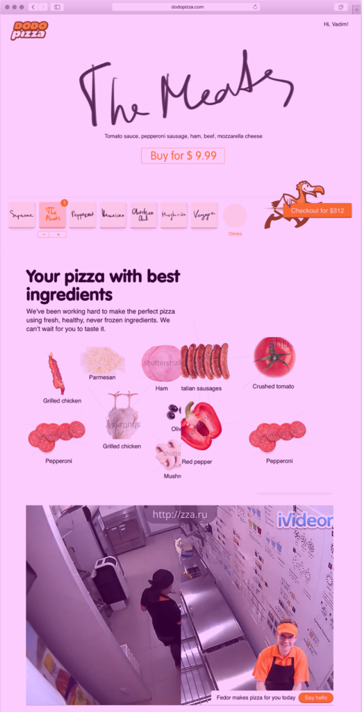
This is the first draft we came up with (it was made pink to point out that it was just a draft). The idea was to put everything we would need on a single page. The top of the page is devoted to ordering. The wide area above the pizzas serves as a sort of cover for our page. We can place a spectacular photo of our pizza or whatever else we want there. The rest of the page is for additional info about our pizzeria. It’s not just another pizza delivery, so we need to tell our visitors about that, don’t we?
Wait a minute. Haven’t we decided to save some money and get rid of these spectacular photos that every pizzeria posts (despite the fact the the pizza in the picture usually doesn’t look like the real pizza delivered to the customers)? Do we need this huge white space on the first screen then? No, actually, we don’t. Let’s put the most important part of the Dodo Pizza website there—our pizzas.
Now there is a little bit more logic in our layout. But do we need this huge header? I assume our customers will start to hate it after two or three orders. It’s hard not to when you have to look at it every time you try to get a pizza.
This header is shouting at you. Can we tone it down?
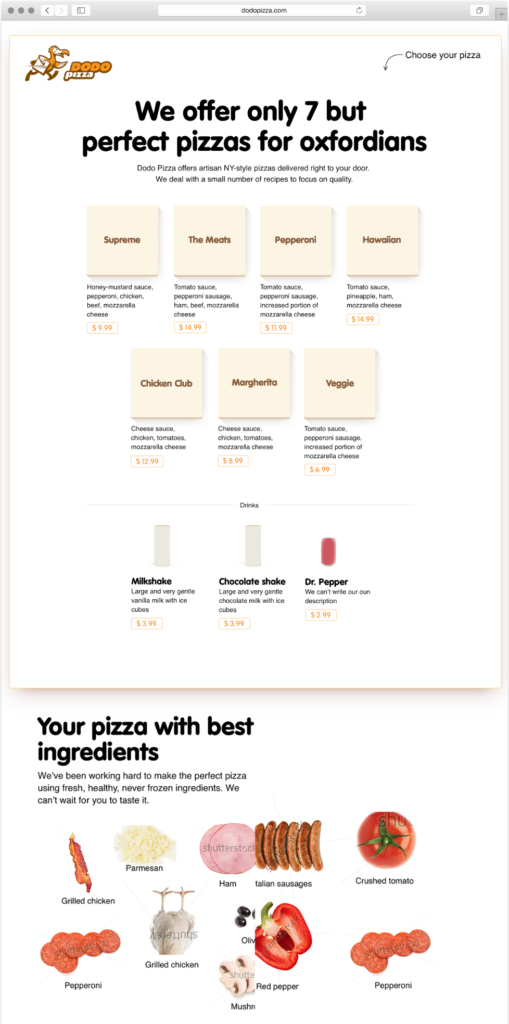
Then we realized that the whole idea of a single-page website was awful. The more text and pictures you put on a page, the more complicated it gets. A visitor could find himself confused. Have I landed on a promo page or on a order page? What am I supposed to do here—read the text or choose a pizza? And on top of that, this sort of page will take a little bit more time to load. Yes, we are talking about seconds, but these seconds matter. So let’s cut everything that isn’t related to ordering, leave only a few teasers in the footer, and move all our explanations to another page.
What we have now looks good enough already. We could probably launch with that kind of website. But after pondering about it for a while, we decided that we had to push the idea even further.
Simplicity is a beast that everyone wants to wrangle but very few actually manage to kill.
You won’t find a company saying that its mission is to make life more difficult and tricky instead of making it simpler and more easy-going.
And yet too often, the world fails to be painless and unchallenging, even in our everyday tasks—like ordering a pizza.
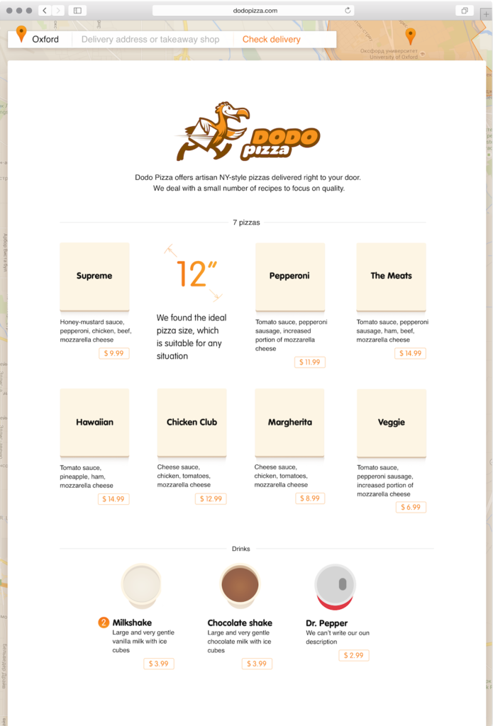
Why? Because making things simple is too damn hard. Look at us—we’ve been working for a while on this project, and yet our customer still has to scroll down the page to place an order. And he or she has to wait a second while our gorgeous background map loads.
Scrolling isn’t clicking, but it’s an unnecessary action we force our dear clients to make. The map in the background looks nice, but it brings no real value and makes the page more complicated. So we asked ourselves a question: Can we do a better job and make a website where everything you need for your order is right there on the first screen and you even don’t have to scroll down the page?
It turns out that we can.
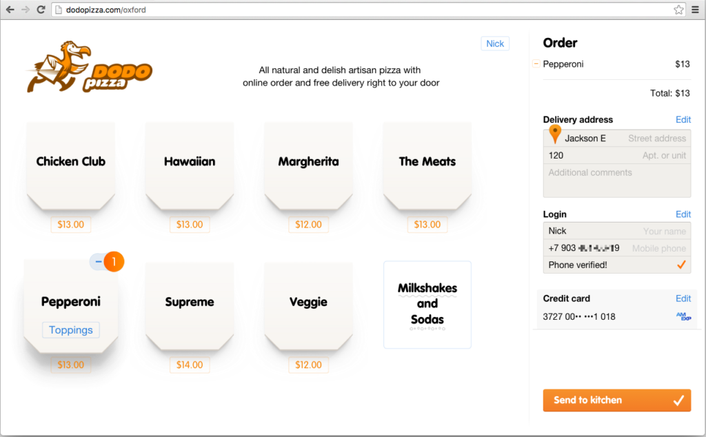
As you can see, we put the delivery form on the right side of the page. That was the tipping point for us.
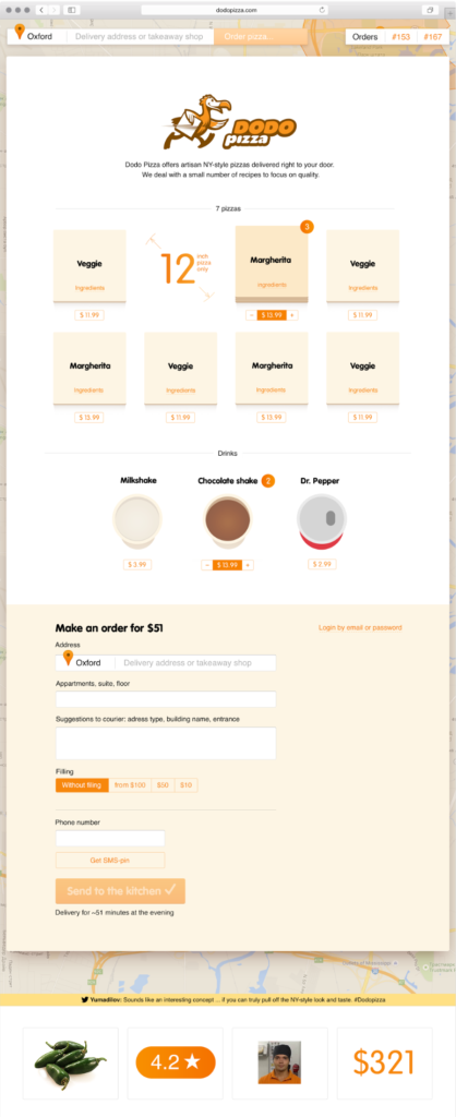
Finally, we saw the webpage we’ve been dreaming of for months. A page so simple that it makes ordering online as easy as pie. Hey, all it takes is just a click on the pizza you want and one more click to send it to the kitchen.
For now, you won’t be able to pay online, but in the near future we’ll add this feature. It will work like this—if it’s not your first order, the system will know your data and you won’t have to add your address or credit card number. Just two clicks for a pizza! Wow. That’s something.
Now, to be fair, let’s compare what we have with the result we got on one of our competitors’ websites when we ordered two pizzas and a soda. We had to click 15 times to make it happen, remember? Here, it will take two clicks for a pizza, one click on sodas, another click on the soda of our choice, and a click to check out. Four clicks instead of 15. Not bad, not bad.
Now, you have the right to ask a question: two clicks, five, ten—does it matter that much? Well, we’ll know in a few weeks. Winter has come. And we’re opening soon.